

Problem Description:
Redesign Siri to allow users to ask about their personal finance in unbounded and unconstrained ways.
Potential Users:
Tech-savvy users, i.e. engineers, financial analysts, sales, designers, and/or PMs
The Platform:
iOS 10
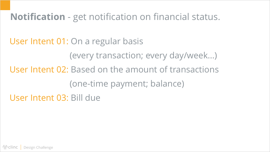
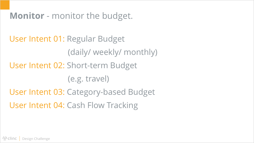
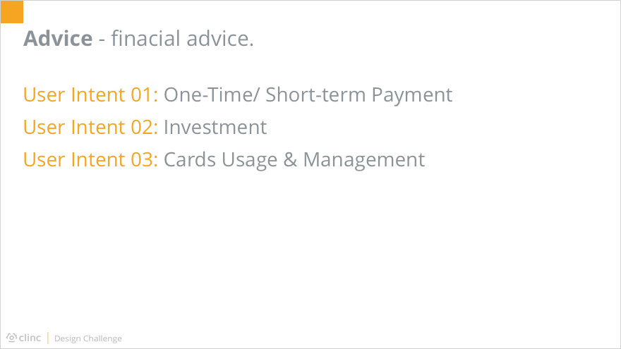
Common & Potential Use Cases (not all required):
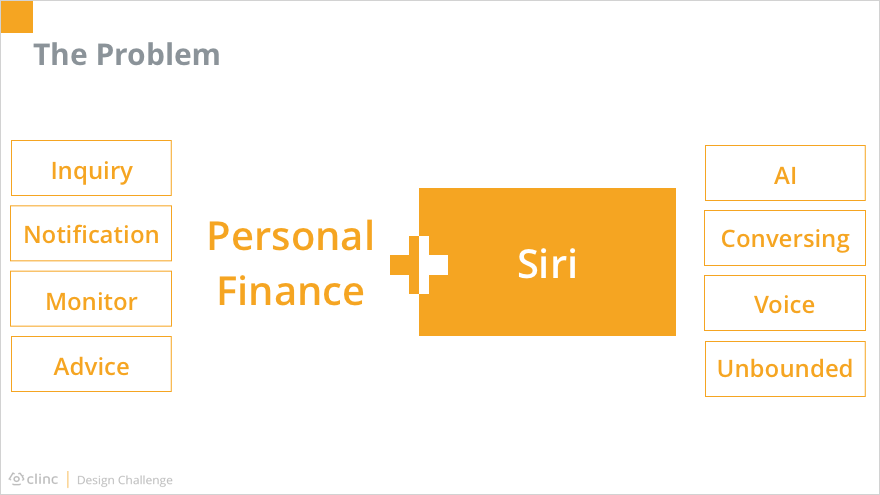
As stated in the challenge description, the problem is how Siri could be expanded to support personal finance management. The major tasks within personal finance could be concluded as: inquiry, notification, budget monitoring, and advice request. Siri, on the basis of voice-controlled artificial intelligence, should allow users to meet their goals in an unbounded and unconstrained way.
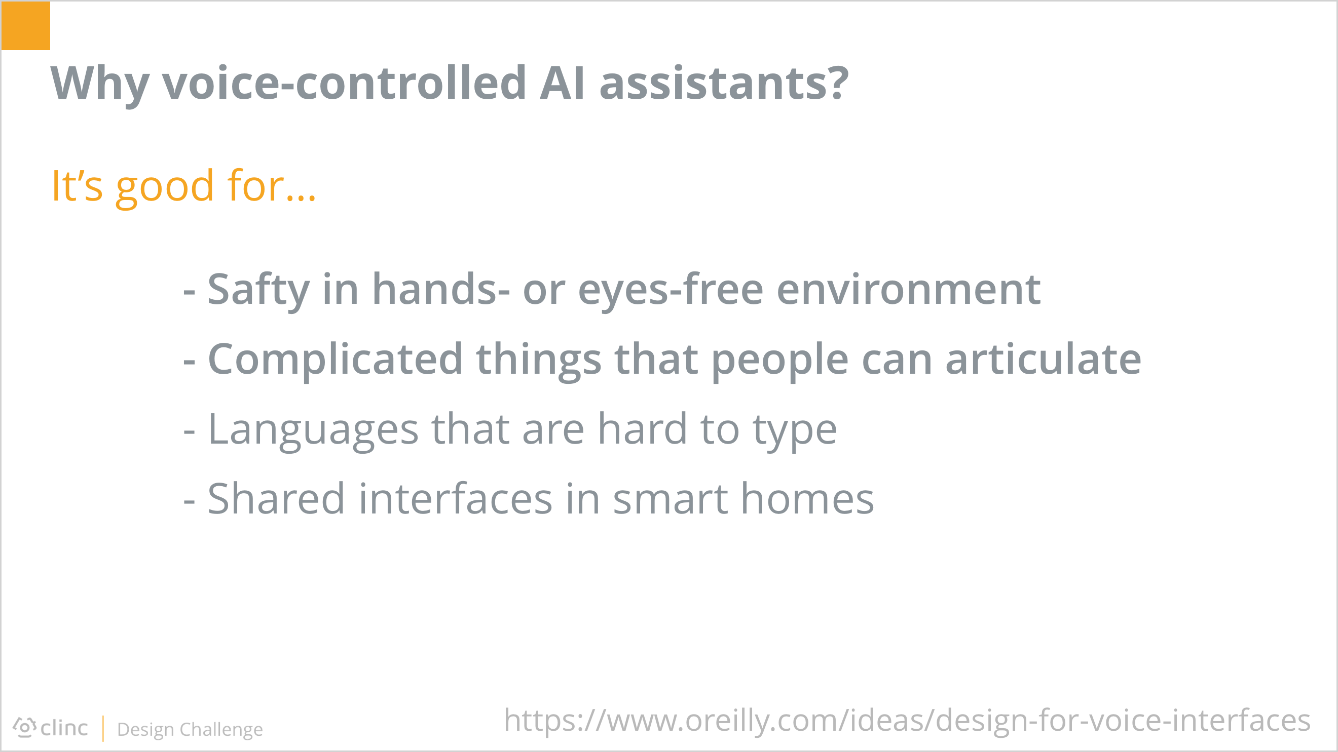
Before diving into HOW Siri could help with personal finance, I firstly took a step back, asking WHY Siri, or voice-controlled AI assistants in general, has a seat at the table of traditional applications, or even beat them in some ways. I conducted preliminary researches online and asked friends about the usage of Siri. It turned out that voice-controlled AI assistants have advantages in certain situations because it could provide a direct and hands/eyes-free way for users to provide complicated input.

The quantitative research result revealed the benefits of Siri and the motivation behind as well.

After I had gained a better understanding in why Siri was prospective, another question occurred to me: among those personal financial tasks, which one could gain the most value out of voice-controlled AI assistants?
I would like to focus on the feature of most potential based on Siri due to the limited time, so I tried to evaluate the 4 typical features by their universality among users and applicability regarding Siri.
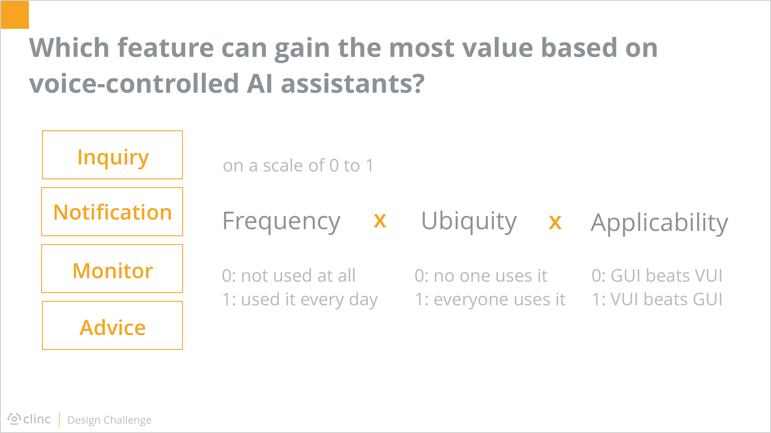
The universality of a feature could further be divided into frequency and ubiquity. Together with applicability, these three criteria were in multiplicative relationships. To simply the mathematical processing, I rated them on a scale of 0 to 1.
Before I actually started the evaluation, I additionally broke down the high-level features into detailed sub-features, or user intents, because the rating of each intents within one feature could differ from each other. The final score of a feature should be the average of each intent of it.

After clarifying how I to get the most reasonable scores on each feature, I collected the evaluation from 3 of my friends together myself, and came up with the final results. It showed the inquiry feature has high scores on both the universality and the applicability, so I decided to unfold my design around it.
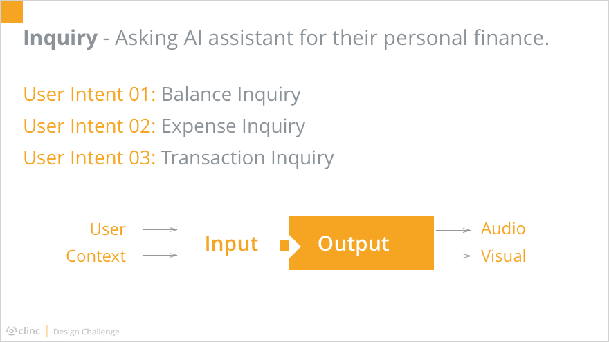
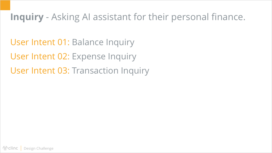
As mentioned above, the inquiry feature could be divided into 3 user intents. No matter which aspect users were interested in, the interaction between them and Siri could be considered as several rounds of input and output.
The input consisted of two parts. One was from the user’s words directly, the other was based on the context information stored from previous conversations.
The output, at the same time, was also composed of two parts: the audio and the visual.
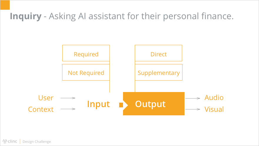
Besides of the classification above, different input and output also had various importance level. For inputs, some were required while others were not. Similarly, outputs could be divided into the direct outcome and those supplementary results.
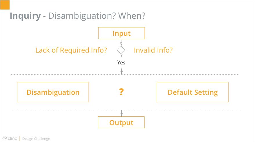
Ideally, Siri should respond as soon as the input was collected. However, the reality was that the inputs were not always 100% complete and valid. Faced with this situation, which was normal, the system had two choices to move forward the procedure. One is to disambiguate, asking the users for clarification until all required information were valid. The other is to use the default setting, without bothering the user too much but based on the system’s own intelligence.
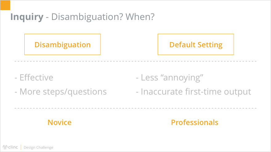
Either disambiguation and the use of default setting had its pros and cons. Disambiguation made the system more effective, since no possibly useless operation would be conducted, thus reducing the operating cost. But it required more steps and questions back and forth between the system and its users, which could be annoying to some people. Using default settings, on the other hand, made the system much less talkative, but also cut down the accuracy of the first-time output.

Here we could take a glimpse of the difference between disambiguation and default setting reflected on interfaces.
With considerations above, I came up with the idea that there could be a way to combine these two approaches. For first-time users who were not familiar with how to ask Siri about their personal finance, the disambiguation could be a preferable way. It could be considered as a step-by-step onboarding process, letting users know what informations were necessary to certain inquiries. After both the user and the system knew how to communicate with each other, the default settings learned from previous experience could be leveraged, which made the system more efficient and humanized to professional users.
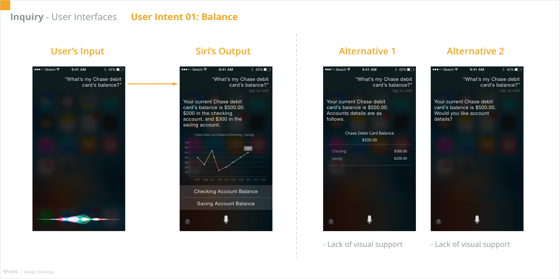
Then I moved forward to creating flow charts for each user intent starting with the balance inquiry.

In terms of expense inquiry, situations were much more complicated. Primarily, the time duration of interest was added as required information. At the same time, there were a series of possible input to further influence the output, such as location and category. As the number of possible input increased, more steps were required to validate all inputs. In this case, using the default setting without directly ask users for clarification could boost the system operating time, which could harm the user experience. Based on human behavior theories, the ideal response time of a system is less than 10 seconds. That being said, any system responding more than 10 seconds had a strong possibility of losing its users at that stage.

Regarding the transaction inquiry, it was in common with the expense inquiry. The only difference was that its output was a list of matched results instead of the amount of them. Therefore, a new type of input could appear: the order of the list. Typically the list of transactions was sorted in the time order, but it was rational as well that users would like the results arranged in numerical order. Meanwhile, when the output was composed of more than one transactions, the audible output should not read out every single piece of information, since people’s short-time memory is not good at storing many numbers at the same time. Instead, it would be better for Siri to respond the overall information by voice and display the list on the screen for users’ convenience.

Having finished the flow charts, I started creating the interfaces. Here, I focused on the happy paths without interruption of invalid input.
As shown, when the user asked about the balance of a specific card, Siri would replied the number together with a line chart indicating the history in the past few weeks or months. If it was a debit card, Siri would additionally provide the accounts balance each and allow the user to view the detail of either account by pressing the button. The reason for automatically providing accounts information was based on my researches among my friends. Usually, when they would like to know about a certain account information, they would ask directly, such as “what is the balance of my Chase checking account?”. And if they mentioned no details but the card in general, they were expecting the overall information of both accounts, “but the supplemental details are pretty cool”.
Similarly, the output of expense inquiry includes the direct part, the number, as well as supplemental details, the amounts of different categories in the pie chart. It was worth notice that here the user didn’t include the card information in the input, but Siri automatically considered it to be Chase debit card. The assumption behind was that this inquiry happened just following the previous balance inquiry. That being said, the card of interest had already been stored as the context information, making the system more efficient and human-like. Moreover, Siri also came up with a follow-up question after its answer. This was based on the predictability of Siri based on the user’s using habit. Besides, such approach would enable more operating time for the system to search for information of possible interest while displaying the answer, whereas answering the question and probing a new one required the system to finish all operations before giving any feedback to the user.


With no previous voice UX design experience, this one-week design challenge is really challenging to me. Given such a complex problem within such limited time, I was totally lost and even panic at the beginning about where to start and how. After a few deep breathe to clear my mind, I gradually calmed down and started to organize my thoughts. Though I have never handled a voice UX case, the design method is shared: first and foremost, to frame the problem, to learn the user, and to understand the technology before directly jumping into the maze of throwing solutions. But then, I realized another challenge here: there was not enough time or resource to conduct adequate researches. A few is better than nothing though, so I turned to the “omnipotent” internet for help. In the following two days, I was immersed in reading answers to any question regarding personal finance and Siri on Quora as well as its Chinese version, and pages come out as search results of keywords “voice ux”, “Siri”, “Alexa”, “Google Now” and so on. During the process of draining the online resource, I felt pieces of ideas were formed bit by bit. Then they gathered together to build vague shapes of what I could create out of them. In the meanwhile, I also conducted small interviews with some of my friends. Fortunately, a large number of people around me fell into the target user group described in the challenge. Though the demographic distribution of interviewees was not as broad as desired, again, it was better than nothing.
In addition to the tough start, lots of problems popped up in the process. For example, building the flow charts for Voice User Interfaces was in great difference from creating work flows for Graphic User Interfaces. I could probably talk about the whole adventure in another five paragraphs, but I would not like to trap you in this page by additional tons of words. Feel free to contact me if you are interested :)
To sum up, I do appreciate this great experience in designing for voice UX. It was challenging but fun, and also deepen my understanding in the design method not only in general but also for VUI.