
preliminary research
To learn more about our target users, we attended support groups at Kellogg Eye Center, University of Michigan and participated in their discussion on daily life.
contextual inquiry
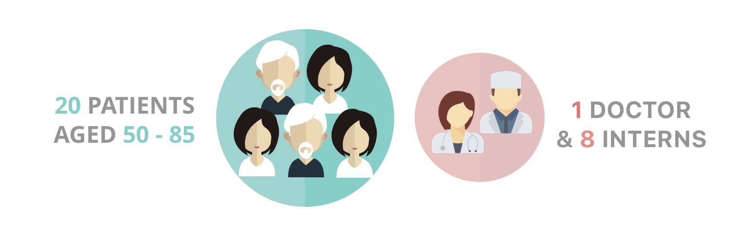
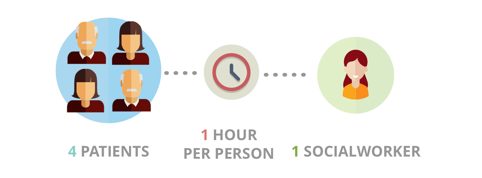
We also conducted interviews and field study with low vision patients as well as a socialworker who volunteers to assist the low vision group. Our conversations focused on the physical and emotional experience of low vision people.
analysis
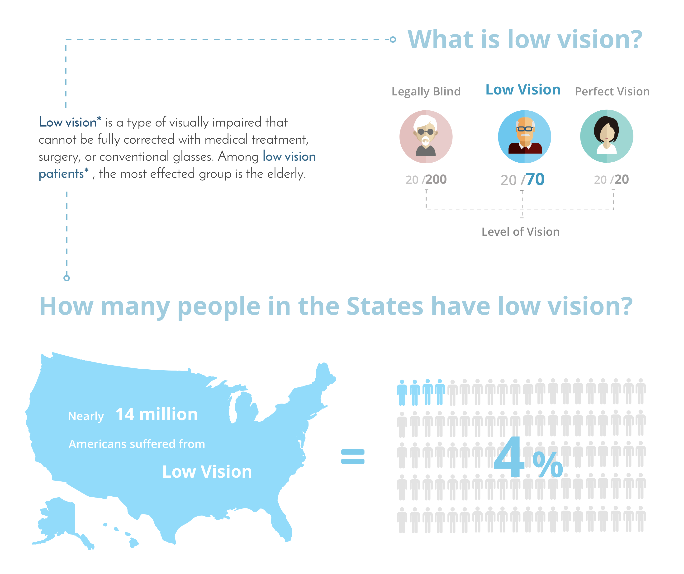
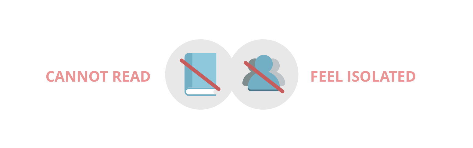
By interpreting the scripts and creating the affinity wall, we found the most frustrating difficulties for low vision are the inability to read and the feeling of isolated.
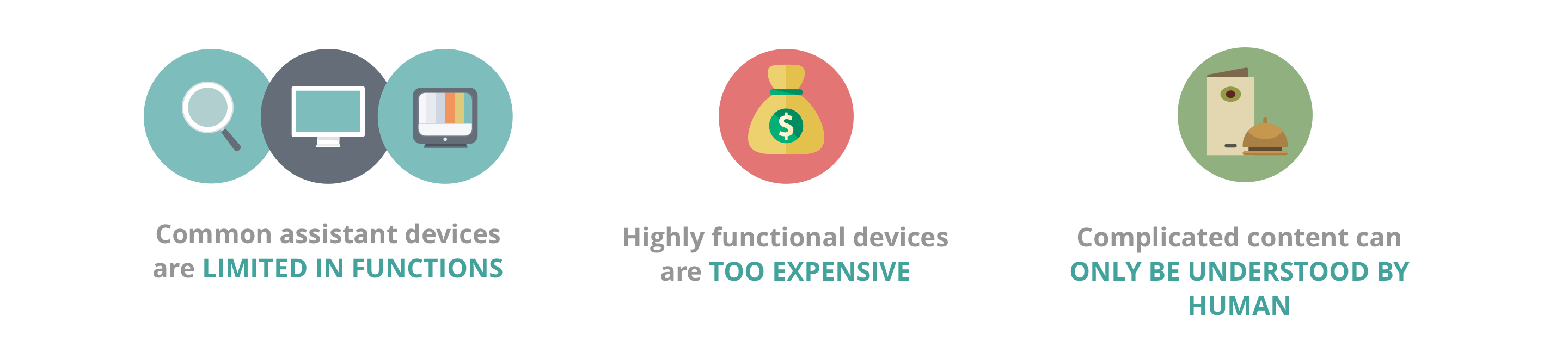
Most visually appealing eye candies are not accessible to low vision people. Therefore, we sacrificed part of the aesthetics to ensure the most usability by the use of larger fonts, simpler icons and colors with high contrast.
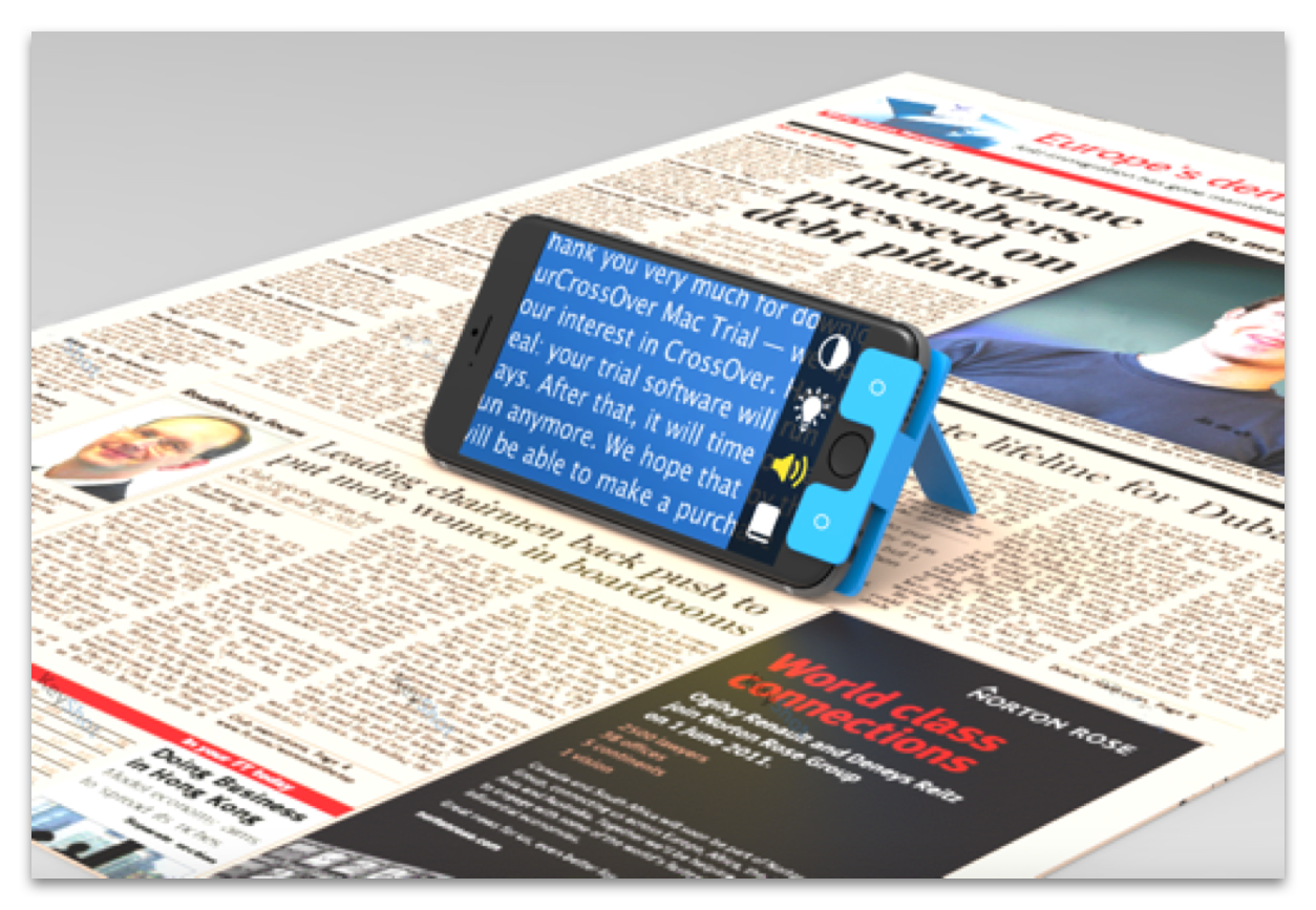
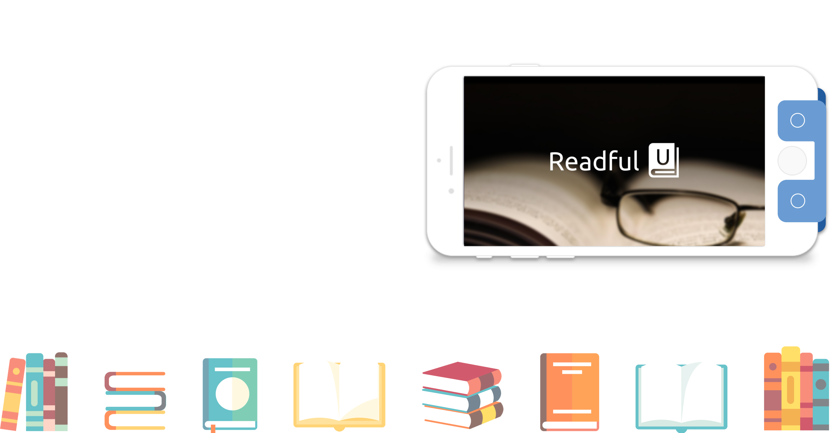
GENERAL FUNCTION UNIT WITH ATTACHABLE STAND
“READ FOR YOU” SOCIAL READING UNIT WITH HOTKEYS
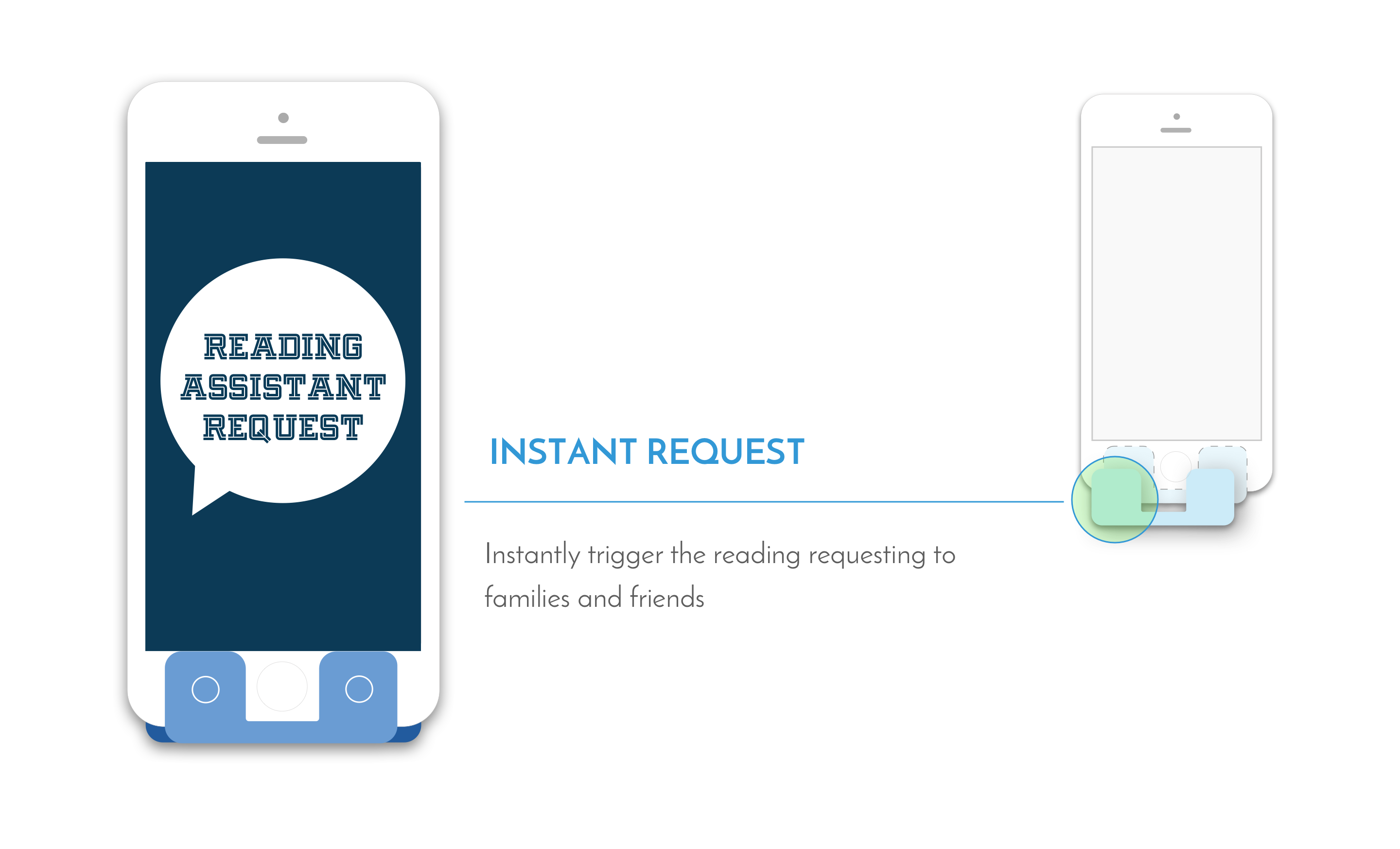
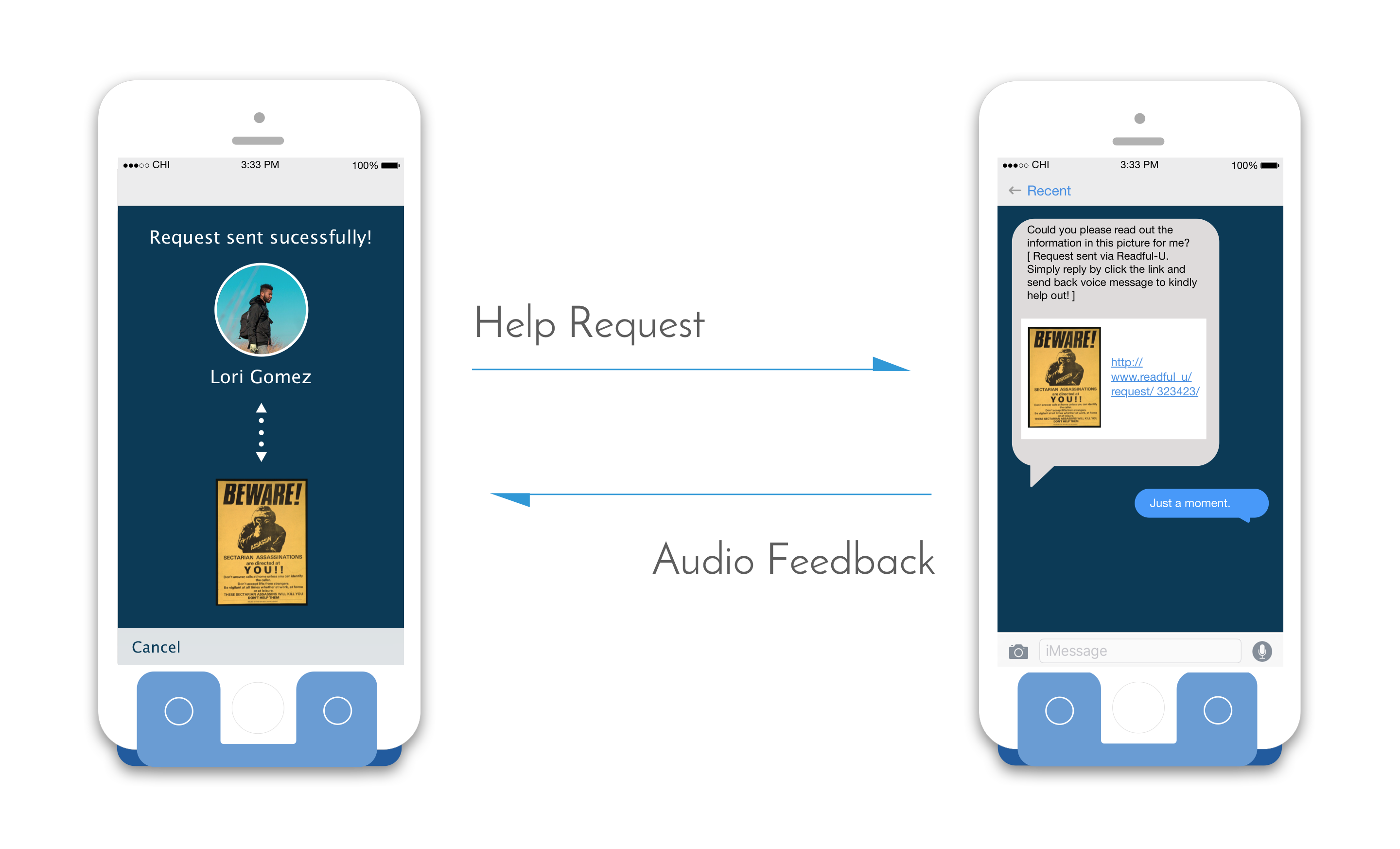
By pressing the left hotkey on the stand, users are able to send reading requests to friends and family asking them to read contents. The request receiver could respond by sending back voice messages without downloading the App.
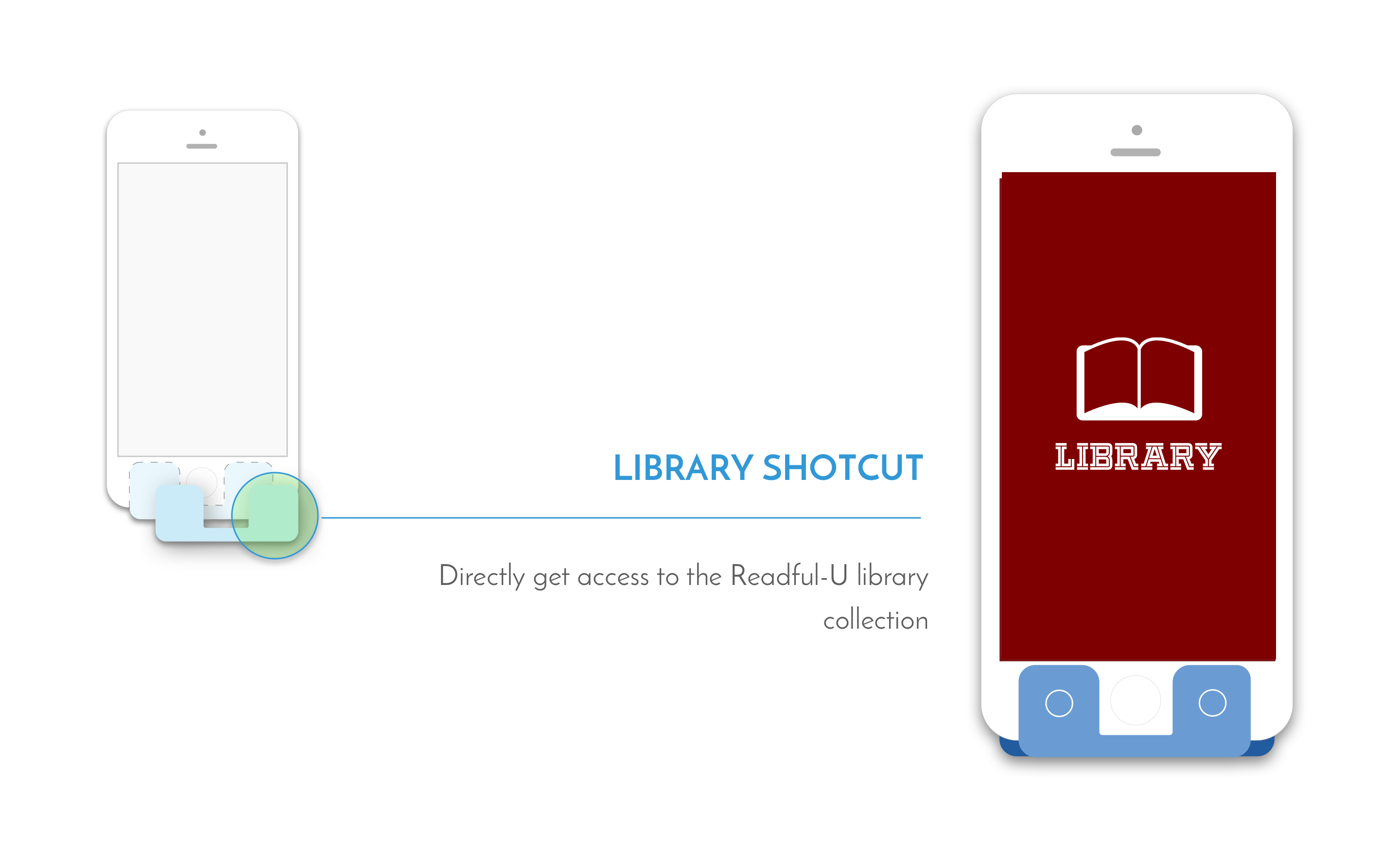
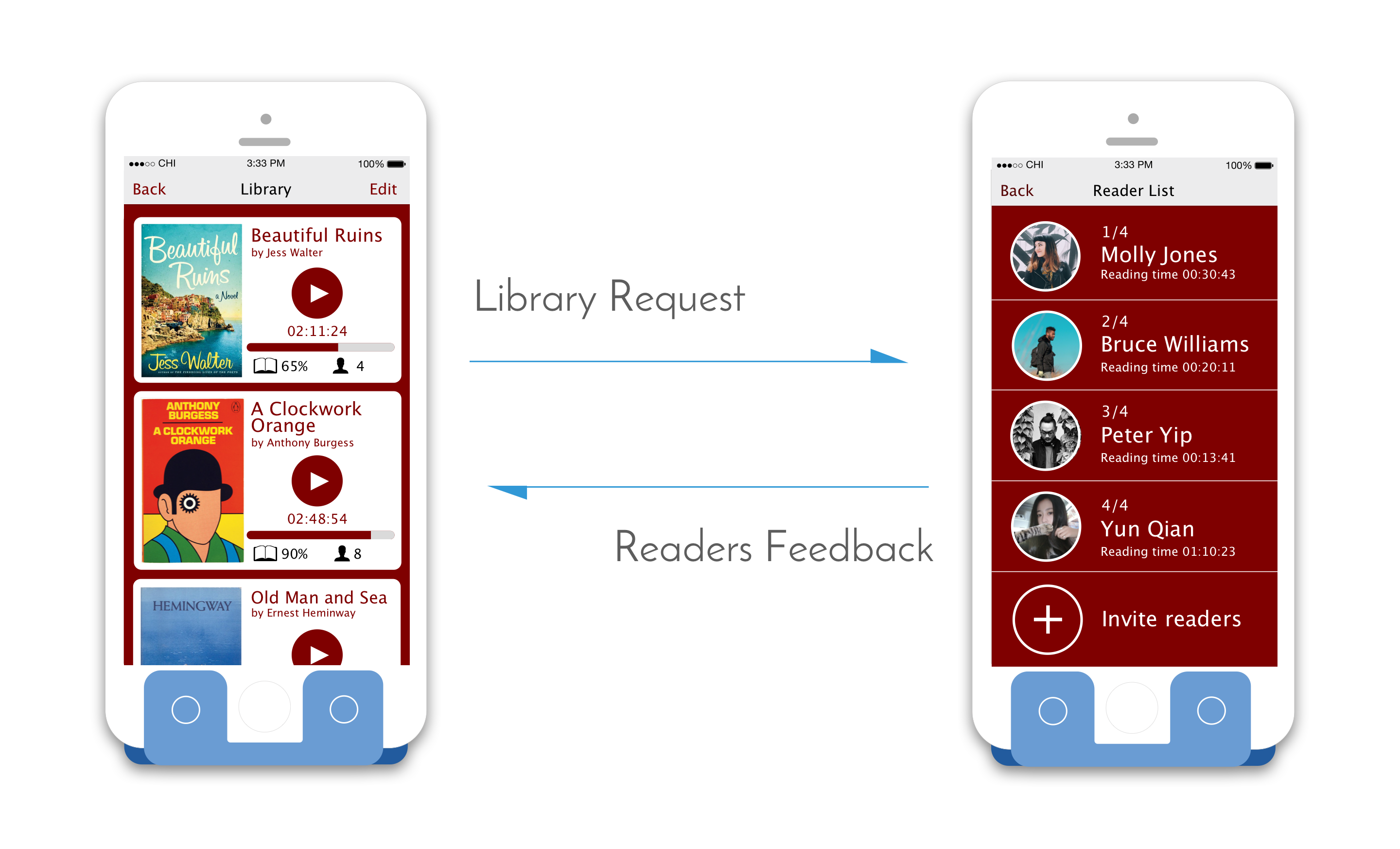
The right hotkey on the stand enable users direct access to the Readful-U library collection. Users can listen to existing audio books, view the profile of "reading angles" and invite more people to read for them via private request messages or even post to social media.
Based on the preliminary research and interviews, we brainstormed multiple approaches. Considering the convenience and cost, we decided to utilize smartphones to develop our solution. In the process of parallel design, I sketched the idea of handheld cartboard which could hold smartphones as electronic magnifiers. Taking consideration of the time and budget constraints, we combined the advantages of different ideas and moved to the next step.
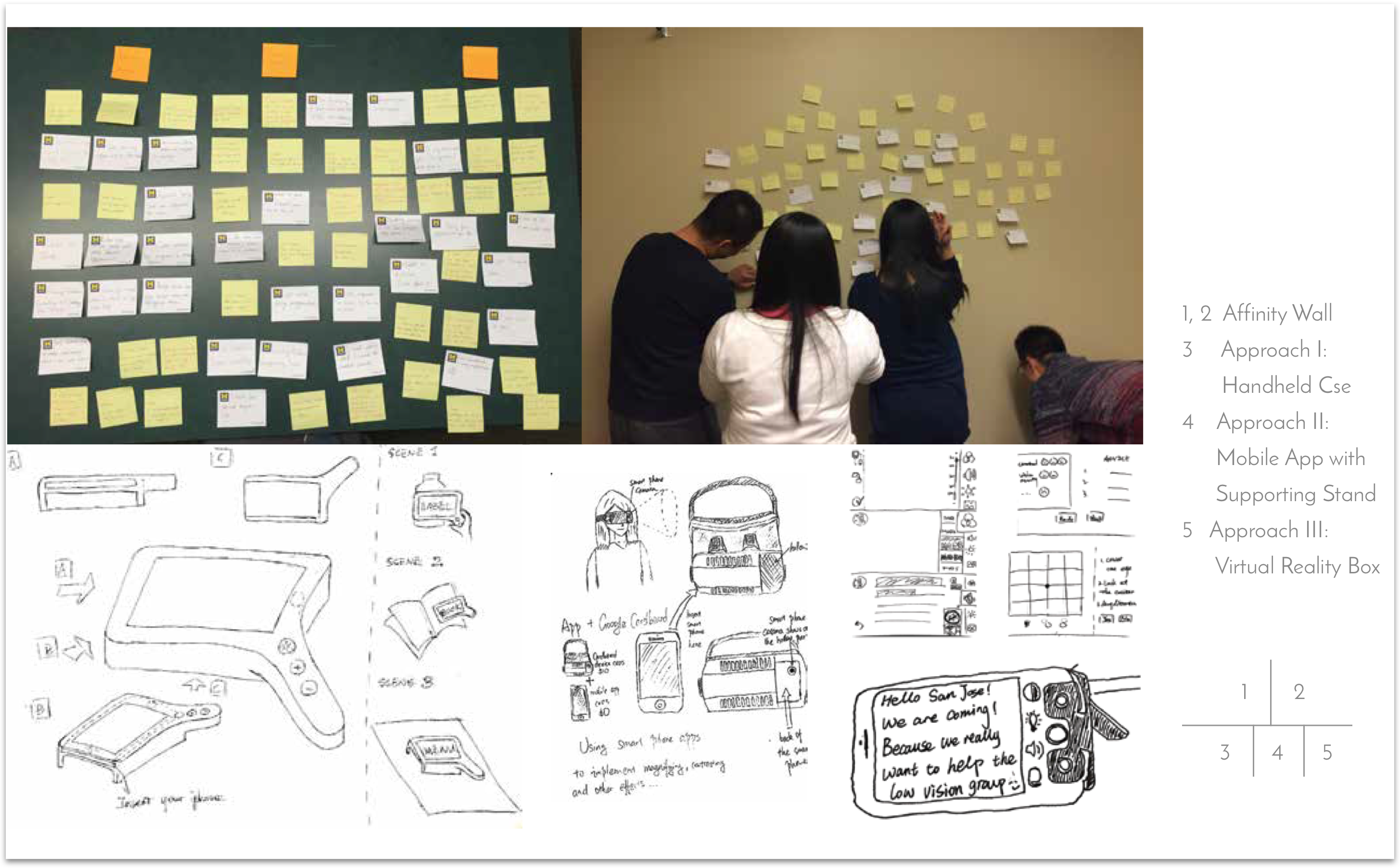
After narrowing down solutions, I sketched out the workflow of the presetting and the general function unit, based on which the social reading function was proposed.
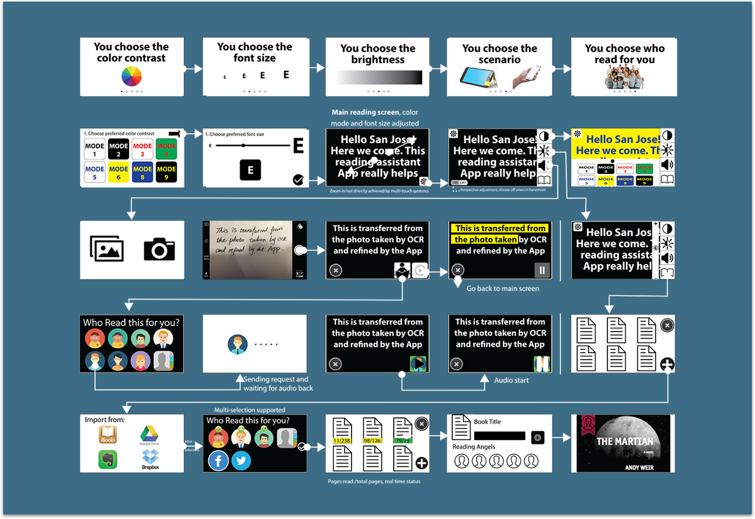
I led the process of creating the mid-fi prototype and finished rapid prototyping of more than half of the interfaces within one day.

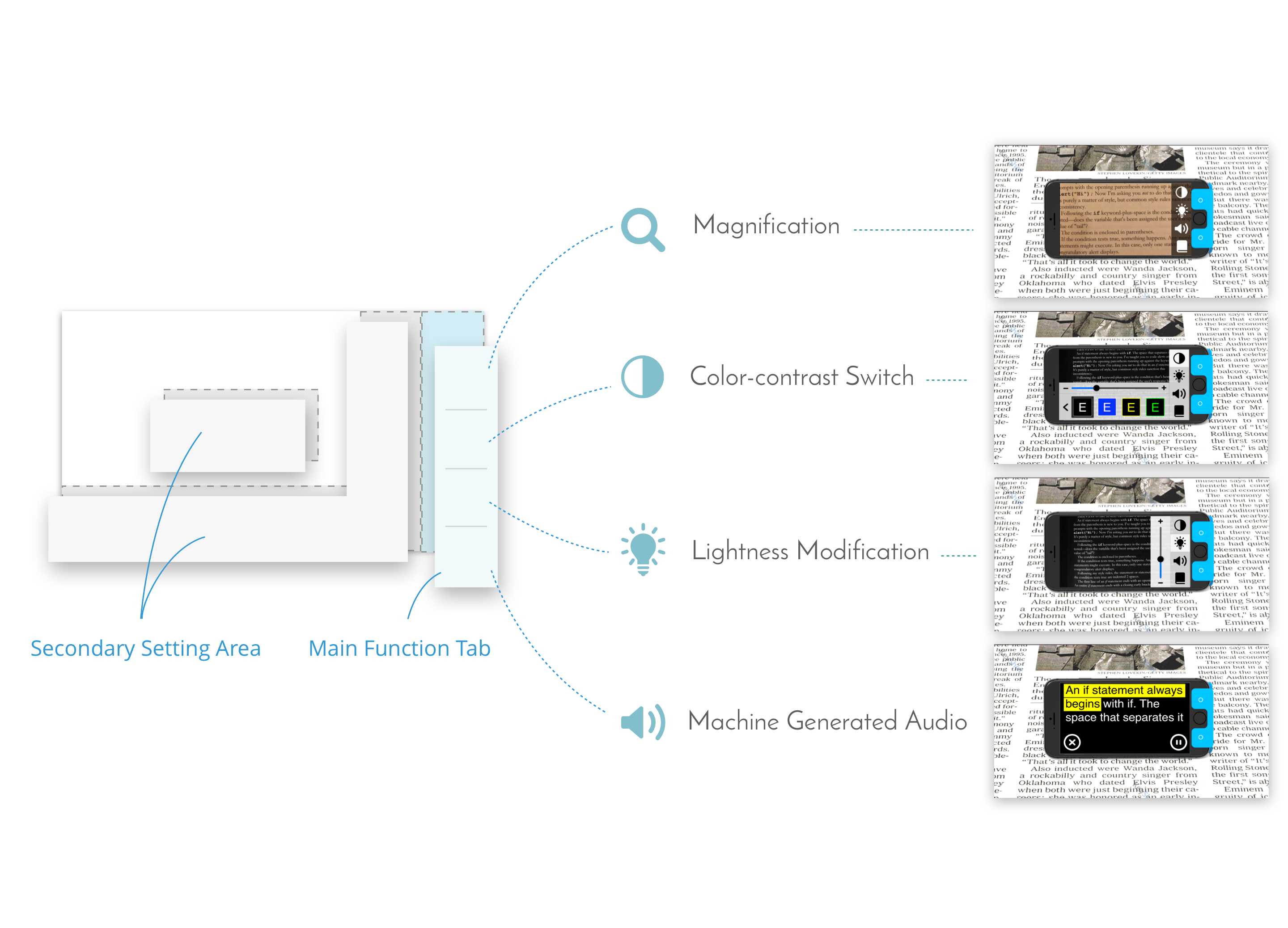
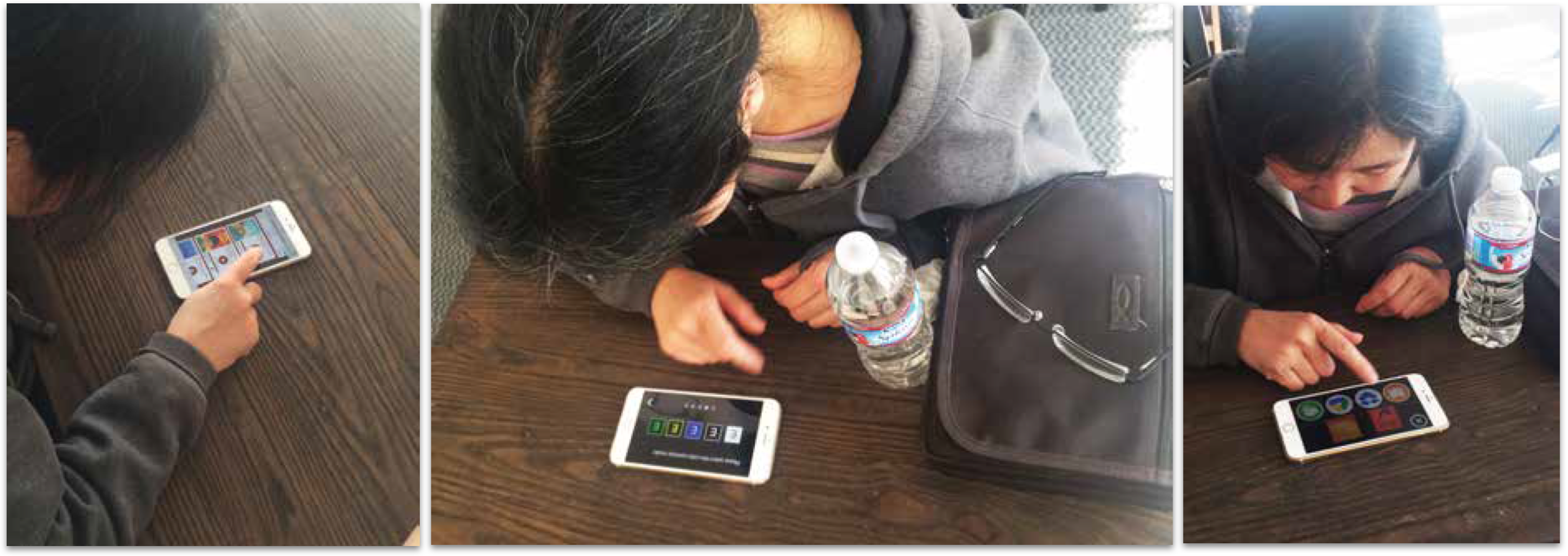
In the usability testing section, the users indicated that we should prioritize visibility of elements much higher than aesthetics. Through using enlarged buttons and simple high-contrast colors, the elements on the user interface are presented in the best way to help users locate them. They also found that, by using the stand, their hands were freed and necks relaxed. They felt less tired and could read for a longer time.They told us that the physical buttons on the stand are easier to locate than virtual buttons, because when the stand was attached, functions were easier to access.
"Readful-U" means a lot to me, since it's the first project that I could work with a team to go through a complete user centered design process. During the process, I applied the methodology learned in class to the real world, and gained direct experience in every step. Moreover, I realized how crucial the target user should be during the whole design process by getting valuable feedback from them in every iteration of design. In addition, I hope this 5-month project could help the low vision group to gain more social awareness and public attention, so that this particular group could get more assistant from the community, thus enjoying a better life. Finally, I really appreciate my team, from whom I learned how to collaboratively work on a design project and to deal with the heavy workload under a high pressure. Thanks to "Readful-U", we entered the final round of 2016 CHI Conference Student Design Competition.